Regression#
For many processes, the exact functional relation between input variables, i.e. the “features”, and output variables, i.e. the “targets”, is not known. In such cases, assuming a linear or low-order polynomial relation between the features and the targets may be a viable approach. The coefficients of the polynomial may then be learned from data. This approach is known as linear or polynomial regression.
Imports#
We need to import the following packages, classes, and functions.
[1]:
# for handling data:
import numpy as np
import pandas as pd

# for plotting:
import matplotlib.pyplot as plt

import halerium.core as hal

# for graphs:
from halerium.core import Graph, Entity, Variable, StaticVariable
from halerium.core.regression import linear_regression, polynomial_regression, connect_via_regression

# for models:
from halerium.core import DataLinker, get_data_linker
from halerium.core.model import MAPModel, ForwardModel, Trainer
from halerium.core.model import get_posterior_model

# for predictions:
from halerium import Predictor

# for analysing graphs:
from halerium.core.utilities.print import print_child_tree
Example data#
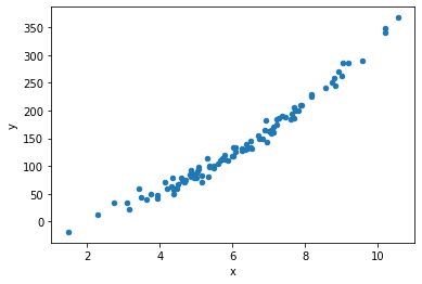
Consider a process with one feature “x” and one target “y”.
We first generate some data for this process:
[2]:
n_data = 100

x_data = np.random.normal(loc=1, scale=2, size=(n_data,)) + 5
y_data = np.random.normal(loc=0, scale=9, size=(n_data,)) - 12 + 4 * x_data + 3 * x_data**2

data = pd.DataFrame()
data["x"] = x_data
data["y"] = y_data

data.plot.scatter("x", "y");
We can extract simple statistical properties such as the mean and standard deviation:
[3]:
display(data.describe())

x_data_mean = data['x'].mean()
x_data_std = data['x'].std()

y_data_mean = data['y'].mean()
y_data_std = data['y'].std()
| x | y | |
|---|---|---|
| count | 100.000000 | 100.000000 |
| mean | 6.078618 | 134.753586 |
| std | 1.825458 | 77.458972 |
| min | 1.470327 | -18.618306 |
| 25% | 4.843912 | 78.938936 |
| 50% | 6.003939 | 119.147073 |
| 75% | 7.227908 | 184.538179 |
| max | 10.549351 | 367.353488 |
In the following, we assume we do not know the exact functional relation that generated that data.
Linear regression model by hand#
Before we discuss how to quickly bulid a regression model using convenience functions, we create a linear regresssion model ‘by hand’.
To build the linear model, we create a Graph containing the variable “x” representing the feature and the variable “y” representing the target. We then add model parameters “slope” and “intercept” to our graph, and use them to connect the feature and target variable:
[4]:
graph = Graph("graph")
with graph:
    x = Variable("x", shape=(), mean=x_data_mean, variance=x_data_std**2)
    y = Variable("y", shape=(), variance=y_data_std**2)

    slope = StaticVariable("slope", mean=0, variance=1e4)
    intercept = StaticVariable("intercept", mean=0, variance=1e4)

    y.mean = slope * x + intercept

hal.show(graph)
We now train a MAPModel with the data.
[5]:
model = MAPModel(graph=graph,
                 data={graph.x: data["x"], graph.y: data["y"]})
model.solve()
inferred_slope = model.get_means(graph.slope)
inferred_intercept = model.get_means(graph.intercept)

print("inferred slope =",inferred_slope)
print("inferred intercept =",inferred_intercept)
inferred slope = 40.32779298524231
inferred intercept = -109.72532491801661
We extract the posterior graph from the trained model and build a ForwardModel with it to compute predictions.
[6]:
posterior_graph = model.get_posterior_graph("posterior_graph")

prediction_model = ForwardModel(graph=posterior_graph,
                                data={posterior_graph.x: data["x"]})

y_linreg_prediction = prediction_model.get_means(posterior_graph.y)

data["y_linreg"] = y_linreg_prediction

ax = data.plot.scatter("x", "y", color='blue', label="true");
ax = data.plot.scatter("x", "y_linreg", color='red', label="lin.reg.pred.", ax=ax);
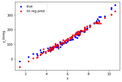
The plot shows that our linear regression model correctly predicts the trend seen in the true data for values of x between 3 and 9. For smaller or larger values, the predictions are significantly off due to the curvature in the true relation between x and y. To also capture that curvature in the data, we need to go beyond a linear model.
Regression model using convenience functions#
A linear regression model with just one scalar feature and one scalar target can be quickly built in the manner described in the previous section. However, building a regression model using beyond-linear polynomials, multi-dimenensional features and targets, and/or multiple features and targets that way can become very involved very quickly. To facilitate building more complex regression models, we can use the convenience function connect_via_regression.
For example, this creates a graph for a quadratic regression model:
[7]:
graph = Graph("graph")
with graph:
    x = Variable("x", shape=(), mean=x_data_mean, variance=x_data_std**2)
    y = Variable("y", shape=(), variance=y_data_std**2)

    connect_via_regression(
        name_prefix="regression",
        inputs=x,
        outputs=y,
        order=2,
        include_cross_terms=False,
        inputs_location=x_data_mean,
        inputs_scale=x_data_std,
        outputs_location=y_data_mean,
        outputs_scale=y_data_std,
    )

hal.show(graph)
result_shape = ()
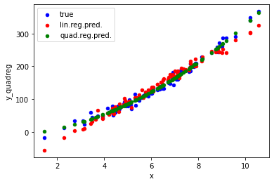
Using a Trainer and a Predictor, we can compute the predictions from our quadratic model and compare them to the linear predctions:
[8]:
trainer = Trainer(graph=graph, data={graph.x: data["x"], graph.y: data["y"]})
[9]:
print_child_tree(graph)
graph
├─regression_y
│ └─location
│   ├─slope
│   └─intercept
├─inputs
├─outputs
├─x
└─y
[10]:
graph.regression_y.location.slope.variance.operand.value
[10]:
array(1.)
[11]:
predictor = Predictor(graph=trainer(), data={graph.x: data["x"]})

y_prediction = predictor(graph.y)

data["y_quadreg"] = y_prediction

ax = data.plot.scatter("x", "y", color='blue', label="true");
ax = data.plot.scatter("x", "y_linreg", color='red', label="lin.reg.pred.", ax=ax);
ax = data.plot.scatter("x", "y_quadreg", color='green', label="quad.reg.pred.", ax=ax);
More on connect_via_regression#
The first argument name_prefix is used to name the entities in the graph holding the regression parameters:
[12]:
print_child_tree(graph)
graph
├─regression_y
│ └─location
│   ├─slope
│   └─intercept
├─inputs
├─outputs
├─x
└─y
Printing the graph’s children reveals that besides regression parameters for the mean of y in regression_location_y, there are also regression parameters for the variance of y in regression_log_scale_y. Thus, the mean of y as well as the residual scatter of y is learned as a quadratic function of x.
The argument inputs specifies the input variables for the regression. This can be either a single variable or a list of variables.
The argument outputs specifies the output variables of the regression, either as a single variable, or a list of variables.
The argument order specifies the order of the regression, i.e. the highest power of the input variables in the regression polynomial. For example, order=1 yields linear regression.
The argument include_cross_terms specifies whether to include cross terms when order>1. Cross terms are not enabled by default, since this can significantly increase the number of model parameters and thereby make the model hard to train without overfitting.
The arguments inputs_location=x_data_mean, inputs_scale=x_data_std, outputs_location=y_data_mean, and outputs_scale=y_data_std allow one to directly include scaling of the data for standardization in the regression. Standardization of the data would otherwise be a required step of data preparation. Here, one just needs to provide the empirical location and scale parameters of the data.
More on these and a numbe of further arguments can be found in the documentation for connect_via_regression.
[ ]: