Applying an SARIMA model to the DutchSales data#
the Data#
In this example we will construct an SARIMA model with Halerium and apply it to the DutchSales data set. The DutchSales date set is a time series series of retail sales index in The Netherlands from 1960 to 1995.
Reference: Franses, P.H. (1998). Time Series Models for Business and Economic Forecasting. Cambridge, UK: Cambridge University Press.)
[1]:
import numpy as np
import pandas as pd
import matplotlib.pyplot as plt
[2]:
sales_data = pd.read_csv("https://vincentarelbundock.github.io/Rdatasets/csv/AER/DutchSales.csv")
[3]:
sales_data.columns
[3]:
Index(['Unnamed: 0', 'time', 'value'], dtype='object')
[4]:
plt.figure(figsize=(12, 6))
plt.plot(sales_data["time"], sales_data["value"])
[4]:
[<matplotlib.lines.Line2D at 0x13b076833a0>]
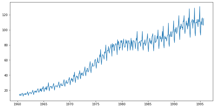
As we can see the time series shows a couple of intersting proterties that we should take into account. 1. the time series is not stationary but grows 2. the values are always positive 3. the fluctuation scale seems to grow with the average value 4. there appears to be a seasonal effect
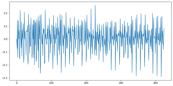
Our first goal towards modeling the process is to find a stationary representation of the process. Here we try two steps: 1. take the logarithm (to account for property 2 and 3) 2. take the first derivative (to account for property 1)
[5]:
stationary_data = np.log(sales_data["value"]).diff()
stationary_data[0] = 0 # the first entry gets nan from the diff function

plt.figure(figsize=(12, 6))
plt.plot(stationary_data)
[5]:
[<matplotlib.lines.Line2D at 0x13b096e4eb0>]
[6]:
np.std(stationary_data)
[6]:
0.10534280621629648
With these transformations the time series looks pretty stationary.
the Model#
We want to create an ARIMA model for the sales data. This means fitting an ARMA model to the differentiated (stationary) time-series. We also want to include a seasonal effect, which makes the model a so-callse SARIMA model.
the SARIMA graph#
[7]:
import halerium.core as hal
By using this Application, You are agreeing to be bound by the terms and conditions of the Halerium End-User License Agreement that can be downloaded here: https://erium.de/halerium-eula.txt
[8]:
p = 4 # how many past values are used for the autoregression part
q = 4 # how long the random noise is correlated
sigma = 0.03 # the stationary time series has a standard deviatin of 0.1,
             # since this standard deviation is the result of combining q noise terms
             # we choose a sigma smaller than 0.1
sigma_obs = 1.e-3 # for sigma_obs we choose a small standard deviation to allow
                  # for deviations between the model and the observed data.

sarima_graph = hal.Graph("graph")
with sarima_graph:

    # the stationary process
    hal.Variable("y")

    # the autoregression contribution
    hal.StaticVariable("a", shape=(p,), mean=0, variance=1)
    ar_contrib = sum([
        a[i] * y[hal.TimeIndex-i-1]
        for i in range(p)
    ])

    # the moving average contribution
    hal.StaticVariable("b", shape=(q,), mean=0, variance=1)
    hal.Variable("epsilon", mean=0, variance=sigma**2)
    ma_contrib = sum([
        b[i] * epsilon[hal.TimeIndex-i-1]
        for i in range(q)
    ])

    # the constant contribution
    hal.StaticVariable("c", shape=(), mean=0, variance=1)

    # the seasonal effect.
    # We choose to model the seasonal influence on a monthly
    # basis. So we introducea a seasonal effects parameter of shape (12,)
    # and introduce the time in year varible, which is supposed to be
    # e.g. 0.166 for year=1980.166
    hal.Variable("time_in_year", distribution="NoDistribution")
    hal.StaticVariable("saisonal_effects", shape=(12,), mean=0, variance=1.)
    seasonal_effect = hal.math.interpolate(time_in_year, saisonal_effects, 0, 1/12)

    # all effects go into the mean of the stationary process
    y.mean = (
        c
        + ar_contrib
        + ma_contrib
        + seasonal_effect
    )

    # the variance is useful to connect the stationary time-series y to the observed data
    y.variance = sigma_obs**2

    # to get to the actual sales we need to intergrate and exponentiate
    # for the integration we use a Dirac distributed Variable
    hal.Variable("log_sales", distribution="DiracDistribution")
    log_sales.mean = log_sales[hal.TimeIndex-1] + y

    # we include the exponentiation into the construction of a log-lormal
    # distributed variable which has a small noise term that allows
    # us to connect it to observed data
    hal.Variable("sales",
                 distribution="LogNormalDistribution",
                 mean_log=log_sales,
                 variance_log=sigma_obs**2)
[9]:
data = {
    sarima_graph.y: stationary_data[:100],
    sarima_graph.time_in_year: sales_data["time"][:100] % 1,
       }
[10]:
m = hal.get_posterior_model(sarima_graph,
                            data=data,
                            method="MAP")
[11]:
posterior_graph = m.get_posterior_graph()
[12]:
n_obs = 100
pred_dist = 200
data = {
    sarima_graph.time_in_year: sales_data["time"][:pred_dist] % 1,
    sarima_graph.y: np.append(stationary_data[:n_obs], np.nan*np.zeros(pred_dist-n_obs)),
    sarima_graph.log_sales: np.append(np.log(sales_data["value"][:n_obs]), np.nan*np.zeros(pred_dist-n_obs)),
}

m_pred = hal.get_generative_model(posterior_graph,
                                  data=data)
[13]:
pred_sales_mean = m_pred.get_means(posterior_graph.sales)
pred_sales_std = m_pred.get_standard_deviations(posterior_graph.sales)
[14]:
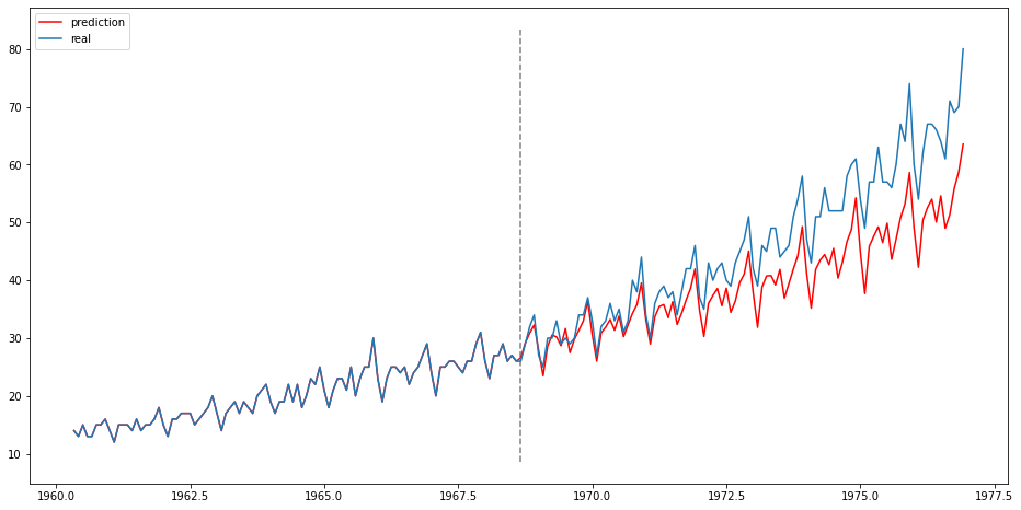
plt.figure(figsize=(16, 8))
plt.plot(sales_data["time"][:pred_dist], pred_sales_mean, label="prediction", color="red")
plt.plot(sales_data["time"][:pred_dist], sales_data["value"][:pred_dist], label="real")
ylims = plt.ylim()
plt.vlines([sales_data["time"][n_obs]], [ylims[0]], [ylims[1]], ls="--", color="grey")
plt.legend()
[14]:
<matplotlib.legend.Legend at 0x13b18639f10>
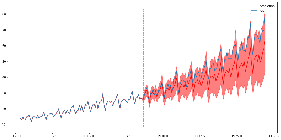
[15]:
plt.figure(figsize=(16, 8))
plt.plot(sales_data["time"][:pred_dist], pred_sales_mean, label="prediction", color="red")
plt.fill_between(sales_data["time"][:pred_dist],
                 pred_sales_mean - pred_sales_std,
                 pred_sales_mean + pred_sales_std,
                 color="red", alpha=0.5)
plt.plot(sales_data["time"][:pred_dist], sales_data["value"][:pred_dist], label="real")
plt.vlines([sales_data["time"][n_obs]], [ylims[0]], [ylims[1]], ls="--", color="grey")
plt.legend()
[15]:
<matplotlib.legend.Legend at 0x13b19d69df0>