Causal Structures - Prediction#
[1]:
%%capture
# execute the creation & training notebook first
%run "02-01-creation_and_training.ipynb"
In the previous section we created and trained our causal structure. We can now make predictions. Let’s create some test data first.
[2]:
test_data_a = {"(a)": np.linspace(4.5, 5.5, 100)}
prediction = causal_structure.predict(data=test_data_a)
Since we passed a dictionary as data to the predict method, the result is also a dictionary.
[3]:
display(type(prediction))
display(prediction.keys())
pandas.core.frame.DataFrame
Index(['(a)', '(b|a)', '(c|a,b)'], dtype='object')
If we pass a pandas data frame we get a pandas data frame in return.
[4]:
test_data_a = pd.DataFrame(data=test_data_a)
prediction = causal_structure.predict(data=test_data_a)
prediction.head()
[4]:
| (a) | (b|a) | (c|a,b) | |
|---|---|---|---|
| 0 | 4.500000 | -3.950142 | 45.574075 |
| 1 | 4.510101 | -4.436720 | 45.443720 |
| 2 | 4.520202 | -4.927574 | 45.272895 |
| 3 | 4.530303 | -5.408997 | 45.130555 |
| 4 | 4.540404 | -5.907117 | 44.996075 |
Note that even though the column ‘(c|a,b)’ depends on both ‘(a)’ and ‘(b|a)’ and we only provided data for ‘(a)’ we get a prediction for ‘(c|a,b)’. This prediction is based on averaging the possible values of ‘(b|a)’ given the provided data for ‘(a)’.
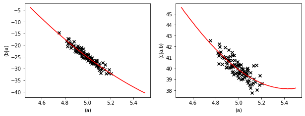
We can plot the prediction and compare it to the training data.
[5]:
pl.figure(figsize=(10,3.5))
fig = pl.subplot(1,2,1)
fig.plot(prediction["(a)"], prediction["(b|a)"], color="red")
fig.scatter(data["(a)"], data["(b|a)"], marker="x", color="k")
fig.set_xlabel("(a)")
fig.set_ylabel("(b|a)")
fig = pl.subplot(1,2,2)
fig.plot(prediction["(a)"], prediction["(c|a,b)"], color="red")
fig.scatter(data["(a)"], data["(c|a,b)"], marker="x", color="k")
fig.set_xlabel("(a)")
fig.set_ylabel("(c|a,b)")
[5]:
Text(0, 0.5, '(c|a,b)')
Prediction uncertainties#
If we want to see the uncertainty margin of the prediction we have to ask the predict method for the standard deviation.
[6]:
prediction_mean, prediction_std = causal_structure.predict(
    data=test_data_a, return_std=True)
[7]:
pl.figure(figsize=(10,3.5))
fig = pl.subplot(1,2,1)
fig.plot(prediction_mean["(a)"], prediction_mean["(b|a)"], color="red")
fig.fill_between(prediction_mean["(a)"],
                 (prediction_mean - prediction_std)["(b|a)"],
                 (prediction_mean + prediction_std)["(b|a)"],
                 color="red", alpha=0.5)
fig.scatter(data["(a)"], data["(b|a)"], marker="x", color="k")
fig.set_xlabel("(a)")
fig.set_ylabel("(a|b)")
fig = pl.subplot(1,2,2)
fig.plot(prediction_mean["(a)"], prediction_mean["(c|a,b)"], color="red")
fig.fill_between(prediction_mean["(a)"],
                 (prediction_mean - prediction_std)["(c|a,b)"],
                 (prediction_mean + prediction_std)["(c|a,b)"],
                 color="red", alpha=0.5)
fig.scatter(data["(a)"], data["(c|a,b)"], marker="x", color="k")
fig.set_xlabel("(a)")
fig.set_ylabel("(c|a,b)")
[7]:
Text(0, 0.5, '(c|a,b)')
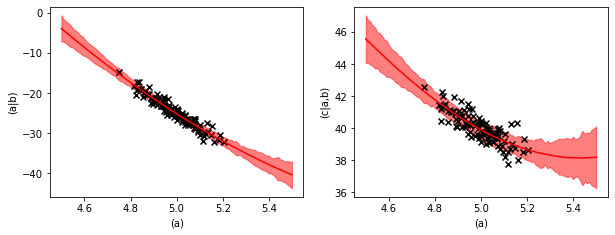
The uncertainty margin consists of two contributions. The learned variance of the quadratic regressions and the uncertainty of the regression parameters.
With the regression equation,
\(y(x) = a \cdot x + b \cdot x^2 + c + \xi\),
the learned variance describes the strength of the random noise \(\xi\) and the uncertainty of the regression parameters quantifies that with finite data we know \(a\), \(b\), and \(c\) only with a finite precision.
Backwards prediction#
We can also evaluate the inverse prediction, e.g. predicting ‘(b|a)’ and ‘(a)’ from ‘(c|a,b)’. We just have to provide data for ‘(c|a,b)’ to the predict method and the causal structure will solve the inverse model.
[8]:
test_data_c = pd.DataFrame(data={'(c|a,b)': np.linspace(36, 44, 100)})

prediction_mean, prediction_std = causal_structure.predict(
    data=test_data_c, return_std=True)

prediction_mean.head()
[8]:
| (a) | (b|a) | (c|a,b) | |
|---|---|---|---|
| 0 | 5.199343 | -35.290706 | 36.000000 |
| 1 | 5.195043 | -35.022511 | 36.080808 |
| 2 | 5.190741 | -34.832743 | 36.161616 |
| 3 | 5.186438 | -34.653216 | 36.242424 |
| 4 | 5.182134 | -34.413845 | 36.323232 |
[9]:
pl.figure(figsize=(10,3.5))
fig = pl.subplot(1,2,1)
fig.plot(prediction_mean["(c|a,b)"], prediction_mean["(a)"], color="red")
fig.fill_between(prediction_mean["(c|a,b)"],
                 (prediction_mean - prediction_std)["(a)"],
                 (prediction_mean + prediction_std)["(a)"],
                 color="red", alpha=0.5)
fig.scatter(data["(c|a,b)"], data["(a)"], marker="x", color="k")
fig.set_xlabel("(c|a,b)")
fig.set_ylabel("(a)")
fig = pl.subplot(1,2,2)
fig.plot(prediction_mean["(c|a,b)"], prediction_mean["(b|a)"], color="red")
fig.fill_between(prediction_mean["(c|a,b)"],
                 (prediction_mean - prediction_std)["(b|a)"],
                 (prediction_mean + prediction_std)["(b|a)"],
                 color="red", alpha=0.5)
fig.scatter(data["(c|a,b)"], data["(b|a)"], marker="x", color="k")
fig.set_xlabel("(c|a,b)")
fig.set_ylabel("(b|a)")
[9]:
Text(0, 0.5, '(b|a)')
The plots of the backwards prediction show us that the backwards prediction usually is a little bit conservative. The predictions stay closer to the average value than the data points.
This is common behavior in inverse modelling and has to do with the fact that a high value of ‘(c|a,b)’ can have multiple causes, a high value in ‘(a)’, a high value in ‘(a|b)’ or a high value of the random noise contribution. This effect is explained in more detail in the inheritance example in the core-documentation.
Apart from predicting values a causal structure can evaluate objectives. We will see what they are in the next section.