Rank Estimation#
[1]:
%%capture
# execute the creation & training notebook first
%run "02-01-creation_and_training.ipynb"
# execute the outlier detection notebook
%run "02-05-outlier_detection.ipynb"
In the outlier detection section we saw how to detect outliers in a test data set and how the outlier threshold influenced the detection results.
In this section we take a look at the .estimate_ranks method.
The corresponding class RankEstimator is actually used by the OutlierDetector under the hood to estimate the typicality of individual data points. Let us apply the rank estimator to the modified test data set from the outlier detection example.
[2]:
ranks = causal_structure.estimate_ranks(data=mod_test_data)
ranks
[2]:
| (a) | (b|a) | (c|a,b) | graph | |
|---|---|---|---|---|
| 0 | 0.547 | 0.267 | 0.742 | 0.660 |
| 1 | 0.974 | 0.839 | 0.876 | 0.987 |
| 2 | 0.452 | 0.873 | 0.757 | 0.877 |
| 3 | 0.089 | 0.575 | 0.555 | 0.313 |
| 4 | 0.880 | 0.891 | 0.869 | 0.991 |
| ... | ... | ... | ... | ... |
| 95 | 0.171 | 0.840 | 0.540 | 0.506 |
| 96 | 0.660 | 0.576 | 0.800 | 0.897 |
| 97 | 0.684 | 0.761 | 0.850 | 0.946 |
| 98 | 0.903 | 0.830 | 0.863 | 0.985 |
| 99 | 0.879 | 0.369 | 0.879 | 0.853 |
100 rows × 4 columns
We see that the ranks are numbers between zero and one. These numbers describe the fraction of data points in a comparison data set with a lower probability that the data point in question. The comparison data set is generated from the trained graph under the hood.
For example, a value of 0.8 means that 80% of the generated comparison data had a probability that was lower than the data point in question.
This is the continuous analogon to the outlier detection. Consequently, we can apply the outlier treshold of 0.05 to the ranks.
[3]:
ranks.loc[(ranks<=0.05).any(axis=1)]
[3]:
| (a) | (b|a) | (c|a,b) | graph | |
|---|---|---|---|---|
| 25 | 0.814 | 0.030 | 0.794 | 0.173 |
| 31 | 0.045 | 0.769 | 0.507 | 0.193 |
| 50 | 0.366 | 0.000 | 0.000 | 0.000 |
| 60 | 0.262 | 0.712 | 0.000 | 0.000 |
| 74 | 0.009 | 0.523 | 0.403 | 0.045 |
We find pretty much the same entries as in the outlier detection section. Some ranks are close to the threshold and might sometimes lie above or below the threshold depending on sampling effects.
Rank estimation tells us how unusual certain data points are. We see that the modified data points with indices 50 and 60 are judged to be very unlikely. None of the 1000 comparison data points had a lower probability than those.
Let’s examine the ranks of the data points 50 and 60 more closely.
The .estimate_ranks method tells us that the values of ‘(a)’ are not particularly unlikely in both of them.
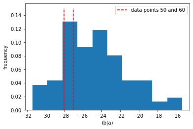
The value of ‘(b|a)’ is judged to be common for data point 60, and next to impossible for data point 50. There is nothing particularly unusual about the value of ‘(b|a)’ in data point 50 if we look at a 1-d histogram.
[4]:
pl.hist(mod_test_data["(b|a)"], density=True)
pl.vlines(mod_test_data["(b|a)"][[50,60]], [0,0], [0.15, 0.15],
          colors="r", label="data points 50 and 60", ls="--")
pl.xlabel("(b|a)")
pl.ylabel("frequency")
pl.legend()
[4]:
<matplotlib.legend.Legend at 0x20bcc86d640>

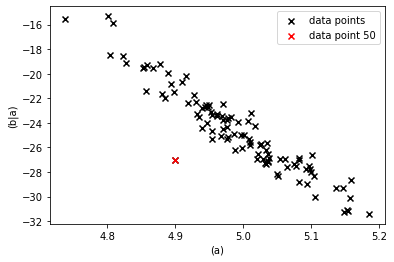
However, given the values of ‘(a)’ they certainly are unlikely as we can see from a 2-d scatter plot.
[5]:
pl.scatter(mod_test_data["(a)"], mod_test_data["(b|a)"],
           marker="x", color="k", label="data points")
pl.scatter(mod_test_data["(a)"].loc[[50]],
            mod_test_data["(b|a)"].loc[[50]],
            marker="x", color="r", label="data point 50")
pl.xlabel("(a)")
pl.ylabel("(b|a)")
pl.legend()
[5]:
<matplotlib.legend.Legend at 0x20bcf1294c0>

The unlikelyness of the combination of the values of ‘(a)’ and ‘(b|a)’ is attributed to ‘(b|a)’ along the causal directions. If ‘(a)’ causes ‘(b|a)’ and the value of ‘(a)’ is common by itself, then the unusual behavior must have occured in the generation of ‘(b|a)’.
For further details about the RankEstimator see the corresponding section in the core-documentation.
Internally the RankEstimator uses the ProbabilityEstimator which is explained in the next section.