Outlier Detection#
[1]:
%%capture
# execute the creation & training notebook first
%run "02-01-creation_and_training.ipynb"
Outlier detection is about detecting unusual data point in a test data set. Let’s create such a test data set.
[2]:
np.random.seed(42)
n_data = 100
parameter_a = 5 + np.random.randn(n_data) * 0.1
parameter_b = parameter_a * (-35) + 150 + np.random.randn(n_data) * 1.
parameter_c = parameter_a * 10.5 + parameter_b * (.5) + np.random.randn(n_data) * 0.01

test_data = pd.DataFrame(data={"(a)": parameter_a,
                               "(b|a)": parameter_b,
                               "(c|a,b)": parameter_c})
Now let us hide outliers in the test_data by modifying some of the values.
[3]:
mod_test_data = test_data.copy()
mod_test_data.iloc[50] = [4.9, -27, 41]
mod_test_data.iloc[60] = [5.1, -28, 40.5]
Let’s see how the modified values stand out in scatter plots.
[4]:
pl.figure(figsize=(10,10))
fig = pl.subplot(2,2,1)
fig.scatter(mod_test_data["(a)"], mod_test_data["(b|a)"], marker="x", color="k")
fig.scatter(mod_test_data["(a)"].loc[[50, 60]],
            mod_test_data["(b|a)"].loc[[50, 60]],
            marker="x", color="r")
fig.set_xlabel("(a)")
fig.set_ylabel("(b|a)")
fig = pl.subplot(2,2,3)
fig.scatter(mod_test_data["(a)"], mod_test_data["(c|a,b)"], marker="x", color="k")
fig.scatter(mod_test_data["(a)"].loc[[50, 60]],
            mod_test_data["(c|a,b)"].loc[[50, 60]],
            marker="x", color="r")
fig.set_xlabel("(a)")
fig.set_ylabel("(c|a,b)")
fig = pl.subplot(2,2,2)
fig.scatter(mod_test_data["(c|a,b)"], mod_test_data["(b|a)"], marker="x", color="k")
fig.scatter(mod_test_data["(c|a,b)"].loc[[50, 60]],
            mod_test_data["(b|a)"].loc[[50, 60]],
            marker="x", color="r")
fig.set_xlabel("(c|a,b)")
fig.set_ylabel("(b|a)")
[4]:
Text(0, 0.5, '(b|a)')
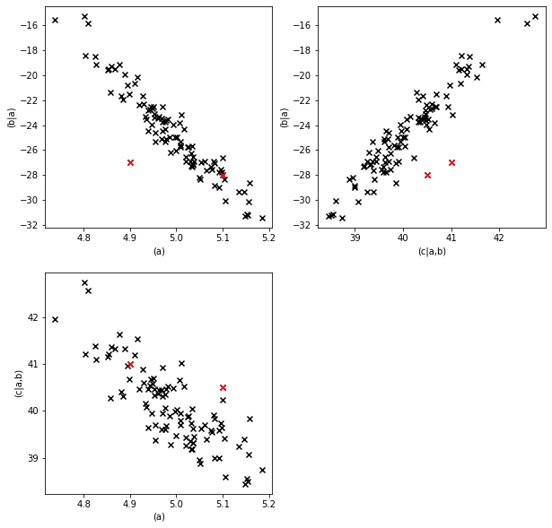
Visually the outliers are fairly detectable in at least one of the scatter plots, but individually the values for each parameter are fairly normal. Let’s see what the .detect_outliers method says.
[5]:
outliers = causal_structure.detect_outliers(data=mod_test_data)
outliers
[5]:
| (a) | (b|a) | (c|a,b) | graph | |
|---|---|---|---|---|
| 0 | False | False | False | False |
| 1 | False | False | False | False |
| 2 | False | False | False | False |
| 3 | False | False | False | False |
| 4 | False | False | False | False |
| ... | ... | ... | ... | ... |
| 95 | False | False | False | False |
| 96 | False | False | False | False |
| 97 | False | False | False | False |
| 98 | False | False | False | False |
| 99 | False | False | False | False |
100 rows × 4 columns
The result is again a pandas.DataFrame with zeros and ones as entries. Zero means no outlier, one means outlier. In a particular row any of the parameters can be classified as an outlier. This estimates which parameter(s) were actually unusual in their specific combination.
There is also a column for the whole graph. This column judges whether the data point as a whole is an outlier. For most purposes this is the decisive column.
Let’s have a look at the rows that contain outliers.
[6]:
detected_outliers = outliers[outliers.sum(axis=1)>0]
detected_outliers
[6]:
| (a) | (b|a) | (c|a,b) | graph | |
|---|---|---|---|---|
| 25 | False | True | False | False |
| 31 | True | False | False | False |
| 50 | False | True | True | True |
| 60 | False | False | True | True |
| 74 | True | False | False | False |
The outlier detector found the two data points we were looking (50 and 60) for but also others.
Let’s mark them in our plot.
[7]:
pl.figure(figsize=(10,10))
fig = pl.subplot(2,2,1)
fig.scatter(mod_test_data["(a)"], mod_test_data["(b|a)"], marker="x", color="k")
fig.scatter(mod_test_data["(a)"].loc[detected_outliers.index],
            mod_test_data["(b|a)"].loc[detected_outliers.index],
            marker="x", color="orange")
fig.scatter(mod_test_data["(a)"].loc[[50, 60]],
            mod_test_data["(b|a)"].loc[[50, 60]],
            marker="x", color="r")
fig.set_xlabel("(a)")
fig.set_ylabel("(b|a)")
fig = pl.subplot(2,2,3)
fig.scatter(mod_test_data["(a)"], mod_test_data["(c|a,b)"], marker="x", color="k")
fig.scatter(mod_test_data["(a)"].loc[detected_outliers.index],
            mod_test_data["(c|a,b)"].loc[detected_outliers.index],
            marker="x", color="orange")
fig.scatter(mod_test_data["(a)"].loc[[50, 60]],
            mod_test_data["(c|a,b)"].loc[[50, 60]],
            marker="x", color="r")
fig.set_xlabel("(a)")
fig.set_ylabel("(c|a,b)")
fig = pl.subplot(2,2,2)
fig.scatter(mod_test_data["(c|a,b)"], mod_test_data["(b|a)"], marker="x", color="k")
fig.scatter(mod_test_data["(c|a,b)"].loc[detected_outliers.index],
            mod_test_data["(b|a)"].loc[detected_outliers.index],
            marker="x", color="orange")
fig.scatter(mod_test_data["(c|a,b)"].loc[[50, 60]],
            mod_test_data["(b|a)"].loc[[50, 60]],
            marker="x", color="r")
fig.set_xlabel("(c|a,b)")
fig.set_ylabel("(b|a)")
[7]:
Text(0, 0.5, '(b|a)')
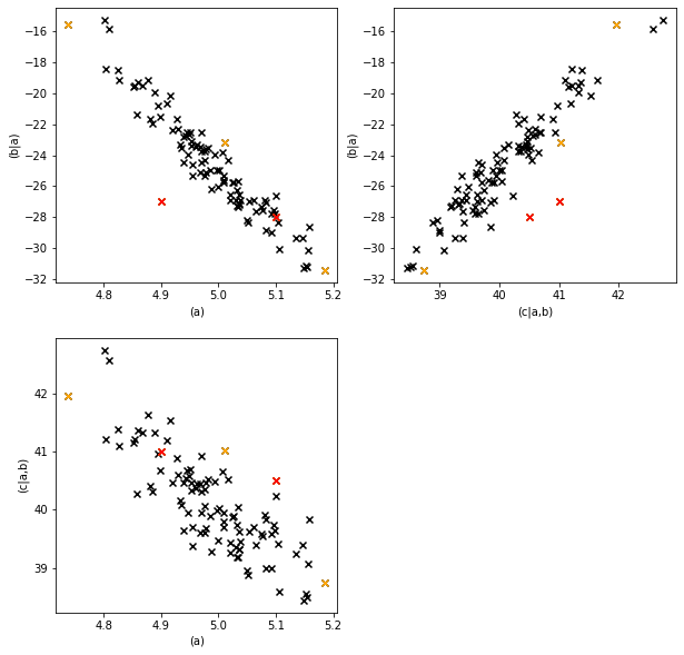
The red points are the values we modified (and that the outlier detector identified), the orange points are the other detected outliers.
The outlier threshold#
Why did the outlier detector classify these as outliers if they actually came from the correct data generation process? The reason for this is the outlier threshold. It’s default value is \(0.05\). This means that values which are less likely than the least likely \(5\%\) of the data generation process are classified as outliers. So we expect around \(5\%\) outliers even in data that come from the correct data generation process.
Setting this threshold is a tradeoff between the sensitivity of outlier detection and the rate of false positives.
Let’s try a stricter value, \(0.001\) instead of \(0.05\).
[8]:
outliers = causal_structure.detect_outliers(data=mod_test_data,
                                            outlier_threshold=0.001)
outliers[outliers.sum(axis=1)>0]
[8]:
| (a) | (b|a) | (c|a,b) | graph | |
|---|---|---|---|---|
| 50 | False | True | True | True |
| 60 | False | False | True | True |
We see that with the stricter threshold the false positives are gone.
However, if we reduce the detection threshold too far we might not detect even the modified data points anymore.
For further details about the OutlierDetector see the corresponding section in the core-documentation.
In the next section we will have a look at influence estimation.